Key takeaways
- Minecraft’s blocks are readable because each one is a flat, distinct colour field. Detail works against that.
- Above 64x, texture noise starts competing with the shapes you built.
- Most builders who try high-resolution packs end up between 16x and 32x.
Every player tries a realistic pack at some point, and a large share of them quietly go back. The reason is not nostalgia. It is that the game’s visual language depends on something high resolution takes away.
Why the default textures are flat
You identify blocks at a distance by colour and value, not by detail. Stone, andesite and deepslate are distinguishable across fifty blocks because each is a consistent tone. That consistency is what makes a build legible – the shapes read, and the materials read, at any distance.
A realistic pack adds variation inside each block. Up close it looks better. At distance it turns a wall into static, and the shape you built stops being the thing you see.
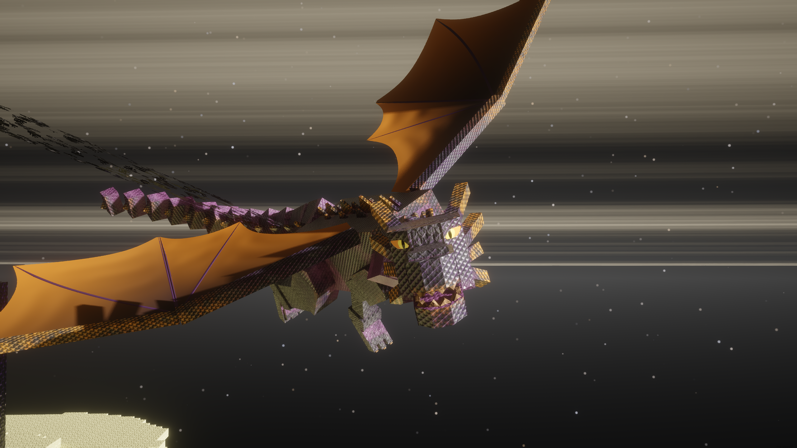
The resolution curve
16x adds nothing and costs nothing. 32x adds surface interest and stays readable. 64x is the point where the fine detail starts to interfere at distance. Above that, packs are effectively making a different game that happens to use Minecraft’s geometry – which is a legitimate thing to want and worth being clear about.
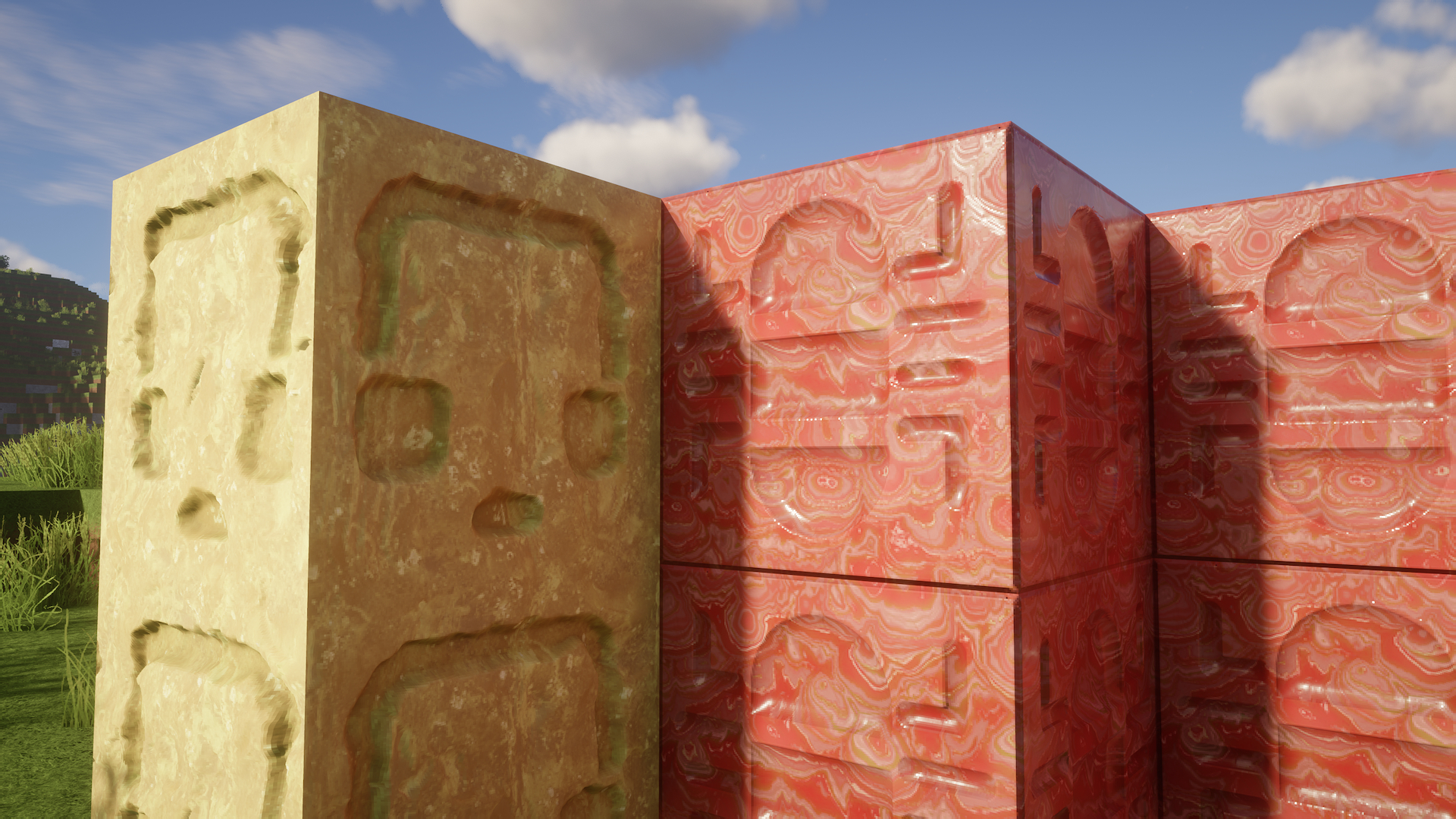
What a high-resolution pack is actually for
Screenshots and interiors. In a tight space with shaders and a considered camera angle, detail is the point and distance legibility does not matter. This is why architectural packs look extraordinary in their own galleries and strange in an ordinary survival world – they are optimised for a use case most play sessions are not.
Our view is that the honest framing is “screenshot pack” versus “play pack”, and almost nobody makes that distinction when recommending one. A pack can be excellent at one and poor at the other without that being a flaw.
Performance, briefly
Texture memory scales with the square of resolution. A 128x pack uses sixty-four times the texture data of vanilla, which on a mid-range machine with shaders and mods is the change that pushes it over.
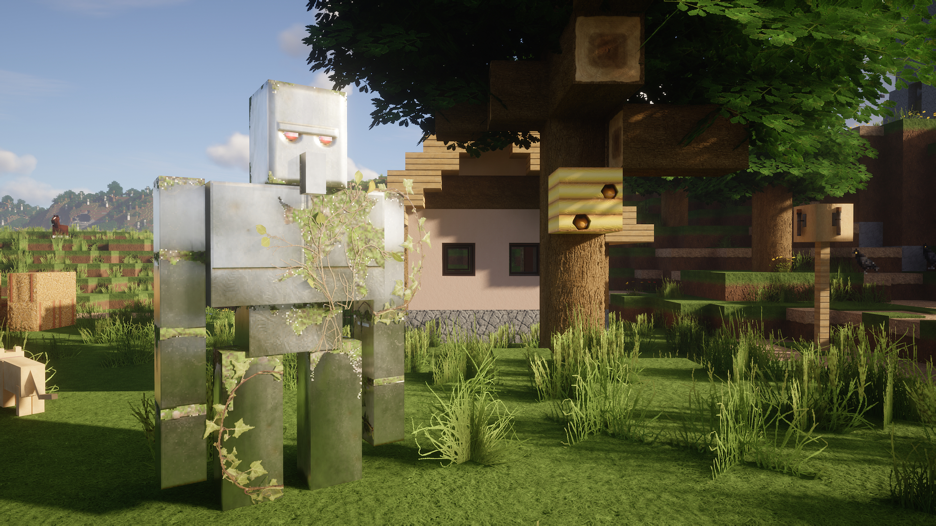
What to run
If you build and play in the same world, 32x with restrained colour shifts is the ceiling worth taking, and Patrix is a reasonable example of the category. If you want the game to look like a different engine for a photograph, take the high-resolution pack and accept that it is a camera setting rather than a way to play.
The mixed approach
You do not have to choose one resolution for everything. Packs can be layered: a detailed pack for the blocks you build with and vanilla textures for everything else, or a realistic terrain pack with vanilla item icons so your inventory stays readable.
Item icons are the case worth calling out. Realistic item art is the fastest way to make an inventory hard to scan, and keeping vanilla icons costs nothing visually while you play.
Connected textures
A pack that supports connected textures removes the grid from large flat surfaces, which is often what people actually want when they reach for realism. It requires a mod or a shader loader that implements it, and the effect on a big glass or stone wall is larger than any resolution increase.
That is a cheaper way to get most of the benefit: keep the resolution low, remove the repetition.
Bedrock and the RTX case
Ray-traced packs on Bedrock are a different category again, with their own hardware requirements and their own visual trade-offs. The same readability argument applies – detailed materials plus dramatic lighting produces beautiful screenshots and a world where distant shapes are harder to read.
What to run day to day
For most players: vanilla or a light 16x-32x pack for play, and a heavy pack swapped in when you want photographs. Resource packs can be switched in seconds, and treating the high-resolution one as a camera lens rather than a permanent setting resolves most of the argument. The build-palette side of the same decision is in the palette guide.
Test it properly before deciding
Judge a pack from a build you already know, at midday, at distance, and then up close at night. Most people judge from the project page gallery, which is shot in the conditions the pack is best in.
The interface-only option remains the zero-risk alternative if what you actually want is comfort rather than detail – covered in the GUI pack review.
What the game is actually asking of its art
Minecraft’s textures do a job most game art does not: they have to be identifiable at a glance, tile infinitely without a visible pattern, and stay legible when a player has built with forty of them at once. Those constraints are why the default art looks the way it does, and they do not go away at higher resolution.
A pack that respects them can be detailed and still work. A pack that ignores them produces beautiful individual blocks and an unreadable wall, which is the failure mode almost every high-resolution pack eventually runs into.
Images: ModernArch project gallery on Modrinth.