A library is the build everyone attempts and almost nobody finishes well. The reason is structural: bookshelves are a single flat texture, they tile aggressively, and a wall of them reads as wallpaper rather than as books. Everything below is about breaking that up.
Never run bookshelves flat
The single rule that fixes most library builds. A continuous run of bookshelf blocks longer than about four looks like a texture, not furniture. Break it.
Three ways that work:
- Vertical dividers. A column of stripped log, dark oak fence or a wall block every three to five bookshelves. This is the cheapest fix and the most effective.
- Depth variation. Recess some bookshelf sections one block into the wall. The shadow line does the work.
- Interruption. Replace a bookshelf here and there with a barrel, a lectern, a chiseled bookshelf, or an empty shelf built from trapdoors.
Chiseled bookshelves are the strongest tool here because their texture differs and they hold actual books, so a wall mixing both reads as a collection rather than a pattern.
Height is the whole atmosphere
A library with a normal three-block ceiling is a room with books in it. The thing that makes libraries feel like libraries is verticality – shelves going up past where a person can reach, with a gallery or ladder to get there.
Five to seven blocks is the sweet spot for a modest one. Above that you want a mezzanine: a walkway one block deep running around the room at mid height, edged with fences or trapdoors, reached by a spiral of stairs in a corner.
The mezzanine also solves a lighting problem, because it gives you somewhere to put lanterns at an intermediate height rather than only at floor and ceiling. Vertical thinking of the same kind applies to any tall interior space.
Light it like a room, not a mine
Bookshelves cannot have torches on them, which is the constraint that pushes people into bad solutions. Options that look right:
- Hanging lanterns from the ceiling on chains, spaced wide.
- Candles on tables and on top of shelf runs – three or four candles gives a warm, uneven light.
- Glowstone or sea lanterns buried behind trapdoors in the shelf dividers.
- A fireplace at one end, which gives a focal point and a reason for the seating.
Keep the light level uneven. A library lit to a uniform brightness feels like an office. If you need to spawn-proof, do it with light blocks or buried sources rather than by adding visible fixtures, following the usual interior lighting approach.
The floor and the middle
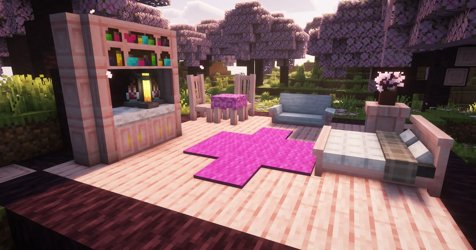
Most library builds get the walls right and leave the middle empty, which is why they feel like corridors. A library needs furniture in the volume, not just around the edge.
What to put there: freestanding shelf units two blocks wide and four tall, arranged in rows with a gap you can walk down. Reading tables made from trapdoors on fence posts. A lectern with a written book in it. Carpet runners to define the walking path.
Freestanding stacks are the big one. They turn a hall into a library because they create the experience of walking between books rather than past them.
Palette
Bookshelves are a warm mid-brown with coloured spines, which means they fight with orange-toned wood. Dark oak, spruce and deepslate all sit better against them than oak or birch.
For the floor, avoid planks in the same tone as the shelves. Polished andesite, dark oak with a patterned inlay, or deepslate tile all read as a floor rather than as more of the same material. The palette guide covers why tonal separation matters more than colour matching.
Scale it down before you scale it up
The common failure is starting with a cathedral. Build a single room first – five by seven, shelves on three walls, a table, a fireplace – and get the divider rhythm and lighting right at that size. Those decisions transfer upward; a bad rhythm does not get better at scale, it gets more visible.
Once the small room works, the large one is the same solution repeated with a mezzanine added.
The details that finish it
A few small additions carry a lot of weight in a library. A ladder leaning against a shelf run, placed decoratively rather than functionally. An open book on a lectern beside a chair. Item frames holding maps on the one wall without shelves. A globe improvised from a mix of blue and green concrete.
Cobwebs in the high corners if the library is meant to be neglected, and none at all if it is meant to be in use – that single choice does more to set the mood than any amount of furniture.
The archive variant
If the room is meant to be a storage archive rather than a reading library, the palette shifts. Barrels instead of bookshelves, chests in rows, labelled item frames above each one, and much colder lighting.
That version is also more useful, because it can be your actual storage room. A reading library is decoration; an archive is a storage room that happens to look like one, and the two designs are close enough that you can build one and convert it.
Images: Handcrafted project gallery.