Most Minecraft builds are too colourful. Sixteen wools, sixteen concretes, sixteen terracottas and a full spectrum of glass make it easy to reach for colour when the problem is texture – and a build made of grey blocks with real texture variation beats a colourful one almost every time.
What texture means here
Two blocks the same colour can look completely different: smooth stone against cobblestone, polished deepslate against deepslate bricks, calcite against diorite. The value is the same; the surface is not.
Building with that difference rather than with hue is what makes stone architecture work, and it is a skill most builders skip because colour is easier.
The grey families
- Stone – stone, cobble, smooth, bricks, cracked, mossy, andesite, polished andesite.
- Deepslate – cobbled, polished, bricks, tiles, cracked, chiselled. Darker.
- White-ish – diorite, calcite, quartz, bone block. Each subtly different.
- Warm grey – tuff, its polished and brick forms, and blackstone at the dark end.
Four families, each with a full block set, spanning near-white to near-black. That is enough range for any build without touching a dye.
Value, not colour
The thing that gives a monochrome build structure is the arrangement of light and dark – value. Heavy dark at the base, mid-tone walls, lighter accents near the top is the classical arrangement and it reads as solid.
Inverting it – light base, dark top – reads as unstable, which is occasionally what you want and usually not.
Pattern at the right scale
Mixing three stone variants randomly across a wall produces noise at close range and mud at distance. Mixing them in patches, with each patch several blocks across, reads as material variation.
The general rule for how much of each to use is the same one that governs coloured palettes, and it is covered properly in the palette guide – the ratios do not change just because the hues are gone.
Where colour belongs
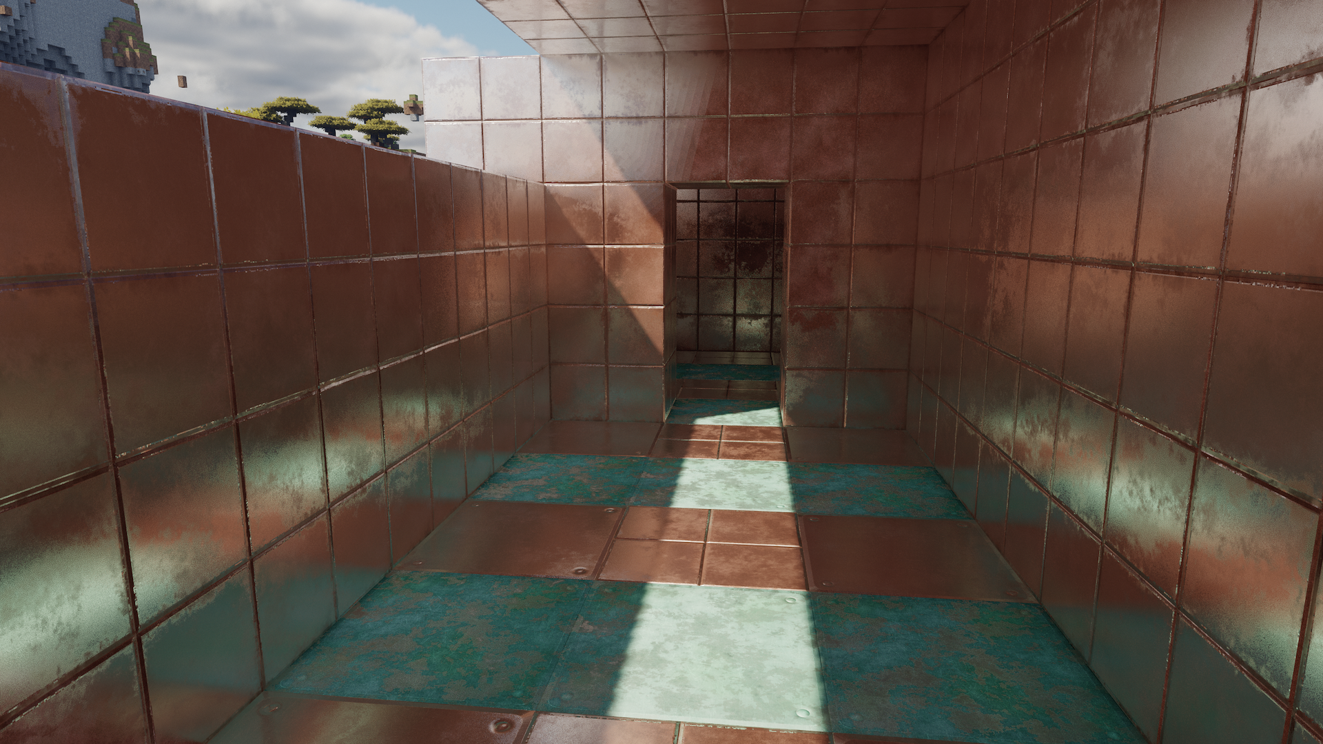
In small quantities, as accent, in places that justify it – a banner, a stained glass window, a copper roof, a door. One coloured element in a grey build carries more weight than forty in a colourful one.
Oxidised copper is the best accent available: it is a colour, it is muted, and it belongs on stone.
Wood in a monochrome build
Wood is the natural warm element against stone and it is what stops a grey build feeling cold. Dark oak and spruce are the usual pairings; stripped logs give a lighter warm tone.
The proportion matters – wood as framing, beams, doors and window surrounds, not as wall surface. Stone walls with wooden structure is a vocabulary with a thousand years of precedent.
Lighting a monochrome build
With no colour doing the work, lighting carries more. Warm light against grey stone is the strongest effect available, and it is why torchlit stone interiors look good even when badly built.
Hiding those sources so the light reads rather than the fixture is the technique, and interior lighting covers how.
Texture at distance
Fine texture variation disappears beyond about twenty blocks, which means a build detailed only in texture reads as flat from far away. Large-scale value changes – a dark base, a light band – are what survive distance.
Building for both ranges means detail at close range and value structure at long range, which is a useful way to think about any large build.
Weathering
- Cracked variants in the lower courses, where damage accumulates.
- Mossy variants on the north side and near water.
- Moss carpet and vines at the base, sparingly.
- Gravel and coarse dirt where stone meets ground.
Weathering is texture with a reason attached, and it is the fastest way to make a grey build look old rather than unfinished.
Why this is worth practising
Builds that rely on colour date quickly and read as decorative. Builds that rely on texture and value read as architecture, and they still work when someone loads them with a different resource pack.
The constraint is also productive: a build where you have banned yourself from dye forces attention onto shape, proportion and surface, which are the things that actually make a build good.
A working grey palette
- Dominant – stone bricks, roughly 60 percent of the surface.
- Secondary – cobbled deepslate or andesite, 25 percent, in patches.
- Weathering – cracked and mossy variants, 10 percent, concentrated low and in shadow.
- Accent – polished blackstone or chiselled stone, 5 percent, at edges and openings.
Those proportions transfer to any of the four families. Swapping stone for deepslate and andesite for tuff gives a darker building with the same structure.
Resource pack independence
A build that relies on the exact colour of a block breaks under a different resource pack. A build that relies on value contrast and shape survives every pack, which matters on a server where everyone sees something slightly different.
Practising it
Build one structure with a self-imposed rule of no dyed blocks and no coloured wood. It is uncomfortable for about an hour and then it is the way you build, because the constraint forces attention onto everything that actually matters.
Images: ModernArch project gallery on Modrinth.